SHOWCASE
Morebeck Designs, Architectural Designers, 2025
Morebeck Designs is a family-run architectural design business that hadn’t updated its branding or marketing materials in over a decade. They wanted a fresh, modern brand identity while preserving their core values of trust, quality, and approachability.
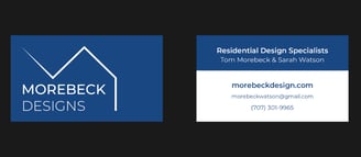
To achieve this, I designed a clean and striking logo that features a stylized architectural outline, paired with a professional and contemporary typeface. This new logo served as the foundation for their updated branding.
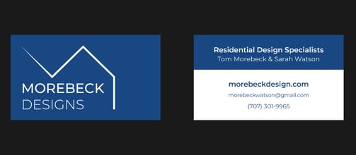
Building on this visual identity, I designed business cards that seamlessly integrated the logo on the front, while the back maintained consistency in typography and color, ensuring a cohesive and professional brand presence across all materials.

Mario Gutierrez, Realtor, 2025
Mario reached out to me to strengthen the branding for his real estate business. His primary goal was to develop a logo that was both recognizable and memorable; one that reflected his core values of trust, reliability, and luxury. In real estate, where clients are making significant financial decisions, it's essential that branding communicates confidence and delivers a sense of security.
Following our initial consultation, I explored several unique design directions, each aimed at capturing the upscale and trustworthy aesthetic he envisioned. While the early concepts resonated with the luxury element, our second meeting clarified that Mario preferred a more minimal approach—specifically, a text-based logo in black and white.
With this refined direction, I shifted focus and began designing multiple typographic concepts. Through several rounds of iteration, we arrived at a final design that successfully embodied all the qualities Mario was seeking: trust, reliability, simplicity, luxury, and memorability.
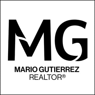
The final logo features bold, stylized initials in a clean sans-serif font, enhanced with subtle curved strokes and reshaping of the edges. Below the initials, his full name and realtor designation are rendered in a lighter weight of the same typeface, creating a cohesive visual hierarchy. The use of black text on a white background delivers striking contrast, while the all-caps styling and minimalist layout project professionalism and high-end appeal.

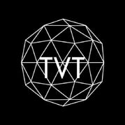
Tri Valley Tutoring, Competition Tutoring, 2025
Tri Valley Tutoring is a student-led business built on the principle of being “for students, by students.” When Daniel reached out, he already had a self-designed logo featuring a complex polyhedron—meant to symbolize advanced skill in STEM subjects like math, science, and coding. He was looking to refine it with a more professional touch.
Given that the organization is run by students but aimed at parents, it was essential for the branding to communicate trust, reliability, and competence. While the concept of a student-led tutoring service is compelling, the visual identity needed to assure parents that these students are capable and serious.
After our initial consultation, I agreed that the polyhedron was a strong visual metaphor—it was modern, intricate, and aligned well with STEM themes. Still, I didn’t want to limit the creative direction too early, so I presented several alternative concepts for Daniel to explore.
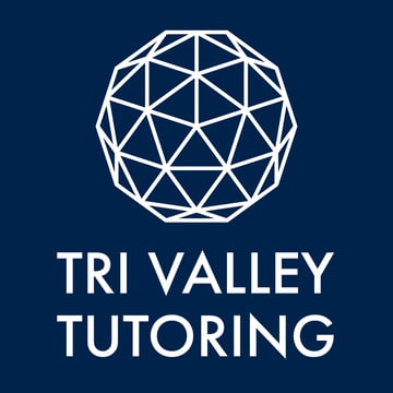
Through multiple rounds of iteration, Daniel ultimately chose to stay with the polyhedron. From there, we refined the design, experimenting with typography, layout, and color until we arrived at the final version: a bold, all-caps sans-serif typeface paired with a redesigned polyhedron set against a navy blue background.
While Daniel’s original logo had a compelling concept, it lacked key design elements that weakened its overall visual impact. Through intentional choices in typography, layout, and color, I was able to preserve the core idea while elevating the design—resulting in a more polished, professional, and eye-catching logo.
↓
(510) 478-5289
huetonemail@gmail.com